
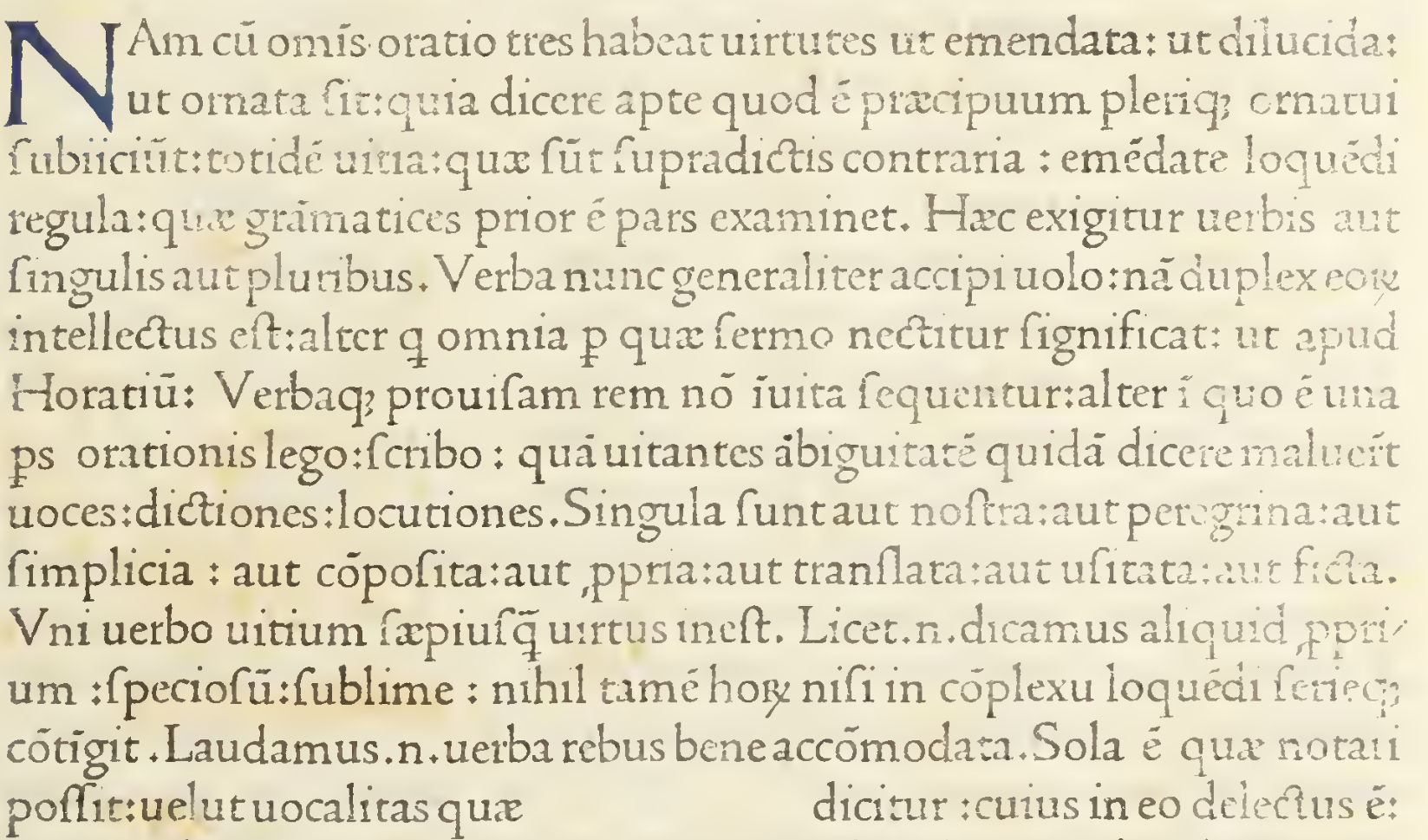
This is the book I'm using as a reference for my historical revival project for school. It's from the 1400s. Someday it will be a downloadable font I think.
I've updated the font a bit and have finished the first draft of the lowercase letters. Let me know what you think. Same link.
https://indestructibletype.com/Jenson/
just finished first draft of the uppercase letters
@owen
This is cool. I especially like the capital J and the n.
@owen How many letters would you need to recreate a font? And which letters would you want?
@B well it's funny because this was in Italy in the 1400s and they didn't have the same alphabet we have now. Can't find any k, w, z and I know for a fact they didn't have j back then and there.
@owen Yes, but what's the bare minimum you would want? And which letters? When you start sketching out a new font, I'm guessing you don't go alphabetically. What do you start with?
@B in the font design world it's often considered best practice to start with capital "H" and "O". I actually do often start with the letter "a" which is probably sacrilegious. I try and get a complete alphabet as quickly as possible because in my mind the only way to really evaluate if your letters are working is using them in words. Like with report cards, alphabetical can solve favoritism.
@owen Hmm, I hadn't thought about favoritism in regards to font design. Are there letters that are more fun to design and other letters you dread?
@B g, a are fun letters, s sucks
@owen Regarding the font.....I'm feeling a bit dense but what should I be seeing that is different from what you first sent us?
@Baba last time I had only gotten to the letter "r" and now the entire lowercase is finished first draft. If it's not noticeable no problem I suppose.
@owen
Owen, I too, love the Jenson font. Every time I look at it I see something new and most of those things make me smile because I find them completely charming. I'm referring now to the upper case letters because that's what I have concentrated on. Soon I will look again at the lower case.
Hey guys!
https://indestructibletype.com/Jenson/
I made a little website where you can test out the progress of this revival. I will try to update it as I work on it if you are interested.